Creating the ultimate fan experience for the biggest football club in the world.
Summary
Digitally connecting an enterprise football brand across all touchpoints by integrating over 23 platforms and services to deliver a world class experience putting the fan at the heart of the digital transformation. Implemented with standardization and accessibility best practices ensuring adoption and inclusivity across the experience. Optimised for multi-region and multi-language, ensuring millions of fans all over the world have the complete fan experience.
Services
Lead Designer, UI/UX
Client
Manchester United FC (2017-2018)
Challenges
Disconnected
Platforms, services, channels and experiences across a historically dispersed legacy digital landscape
Engagement
Drive greater fan engagement through a richer, more personalized, fan-centric connected best-in-class digital football experience
Reach
An untapped global fan base with a desire to connect to it’s 659 million fans and reach a target of 1billion
Conversion
Increase customer conversion through media, merchandising, membership and B2B sponsorship and partnerships
Opportunities
Reconnect
Multiple platforms, services and channels together into one single enterprise eco-system creating a platform of platforms that is fast, stable, intelligent and powerful
Re-engage
With Manchester United fans around the world, using human-centered techniques to gather insights, trends and desires through research, interviews, analytics and data points
Unite
With fans around the world in innovative ways and further strengthen and grow our commercial revenues
Convert
Looking at data, statistics, business logic and processes across omni channels to convert customer satisfaction through brand, merchandising and data
My role & responsibilities across the program
• Implemented a design delivery mechanism to facilitiate design sign-off with the product team in order to get designs into development.
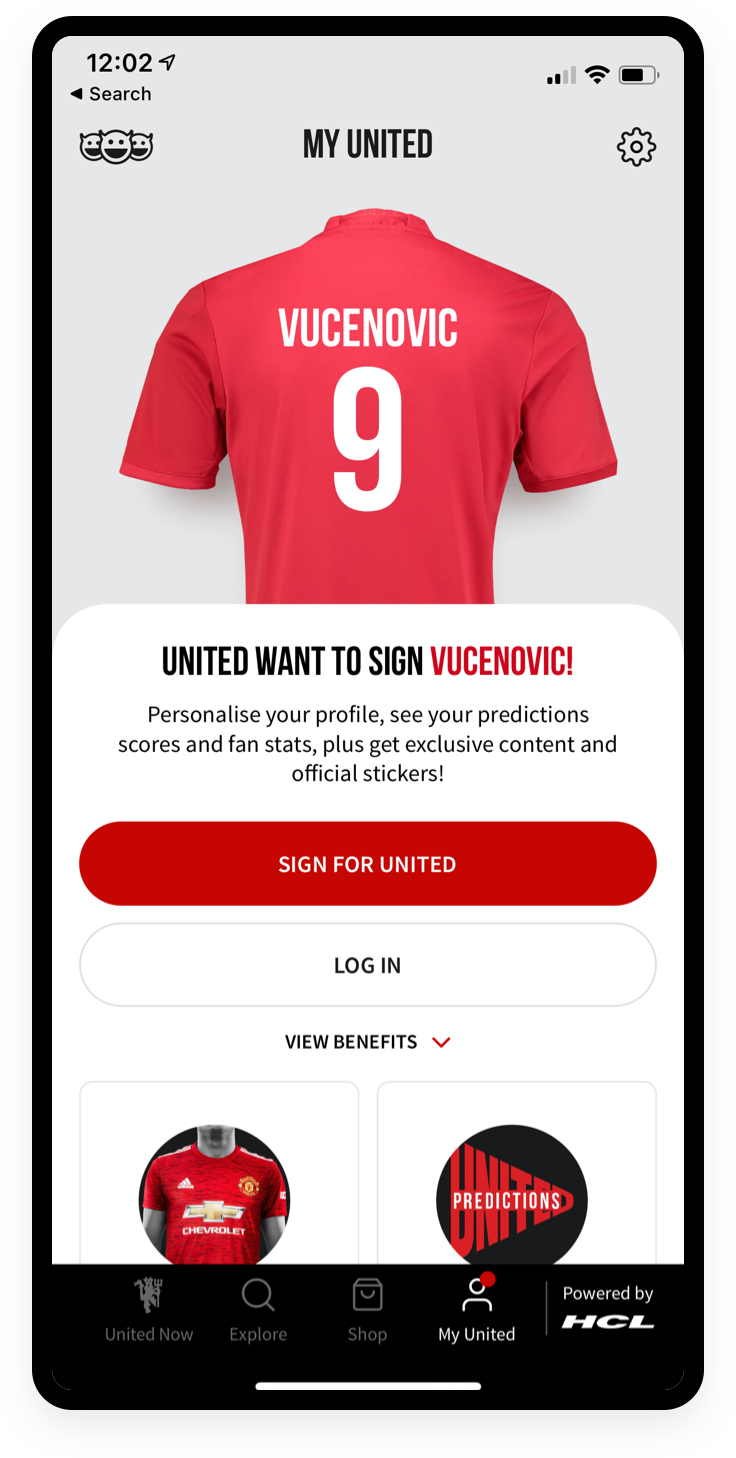
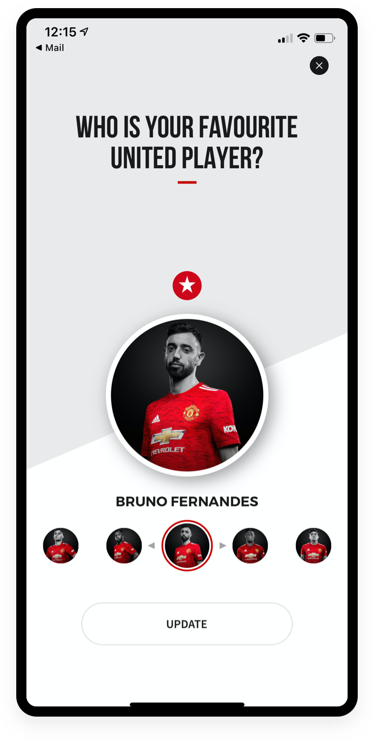
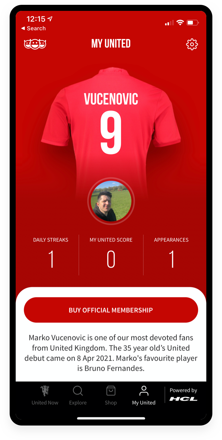
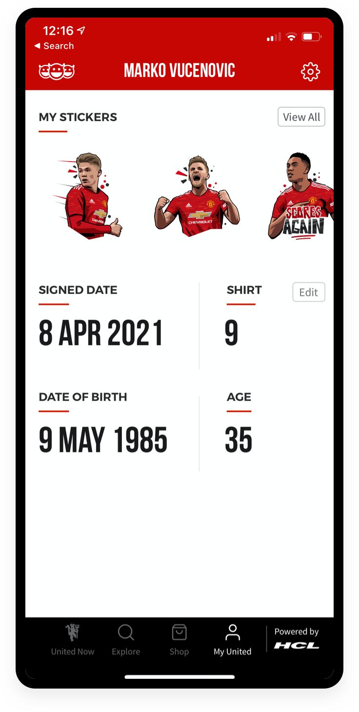
• Lead the art direction and production of the Matchday experience, My United and all second-screen experiences whilst inputting on the global design of the product.
• Established a process for design QA, working with the engineers to ensure the quality of the product did not falter from the approved designs.
• Worked closely with the Manchester United brand team on translating their brand vision into the app and ensuring what we put out there is authentic to the brand.
• On site in Manchester during the duration of the program, allowing for collaboration with the Product Team on a daily basis - accelerating sign off on feature sets.
• Building a progressive digital style guide, which will form the foundation of the future design system. Documenting all components and the rules that guide them.
• Ensuring design output meets accessibility requirements and has been optimised for multiple languages and regions across the world.
Building an instant connection between the fans and club through an engaging and interactive onboarding process
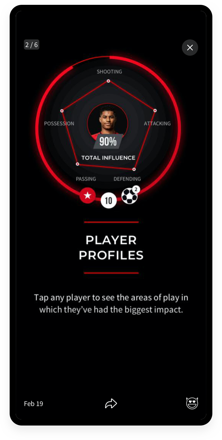
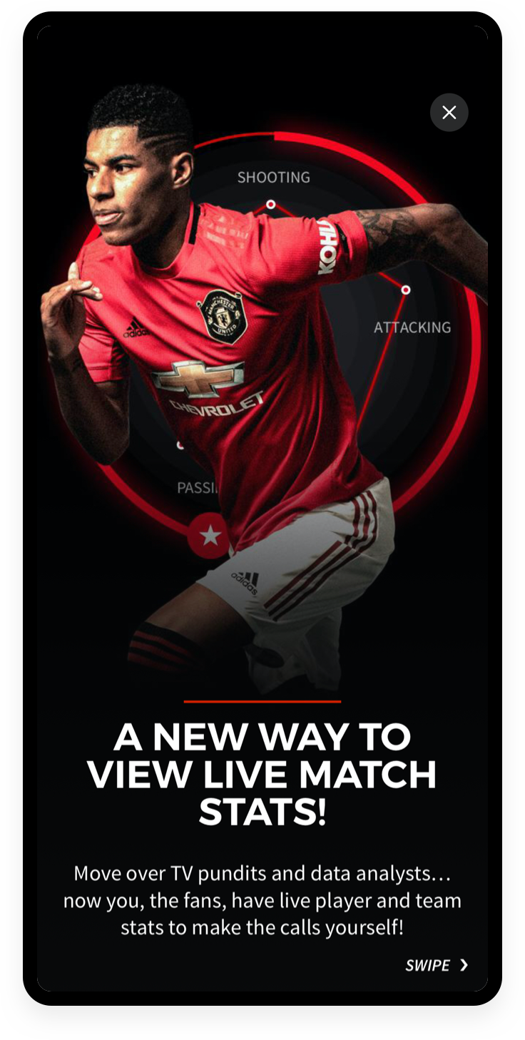
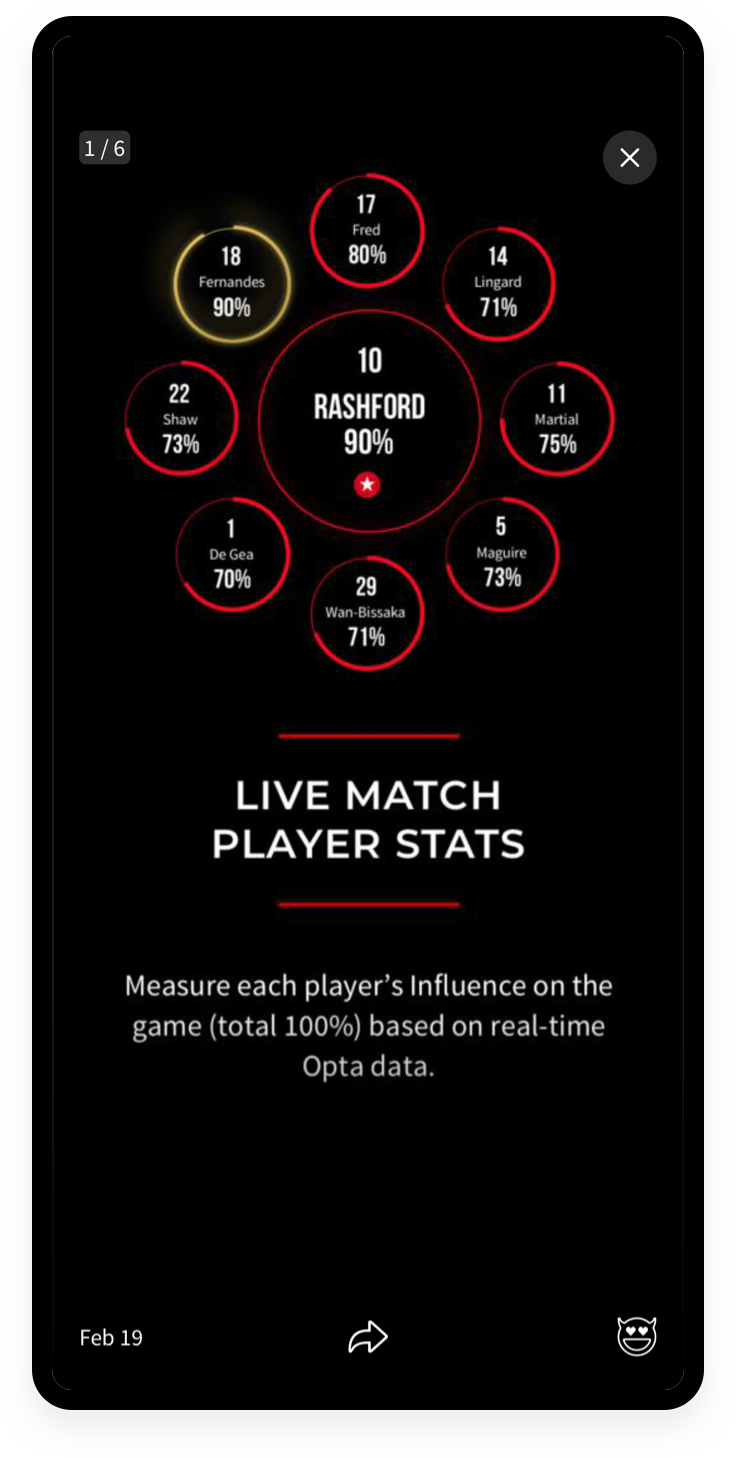
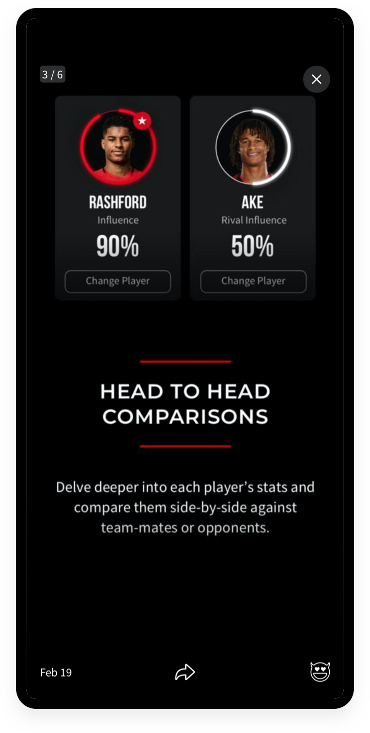
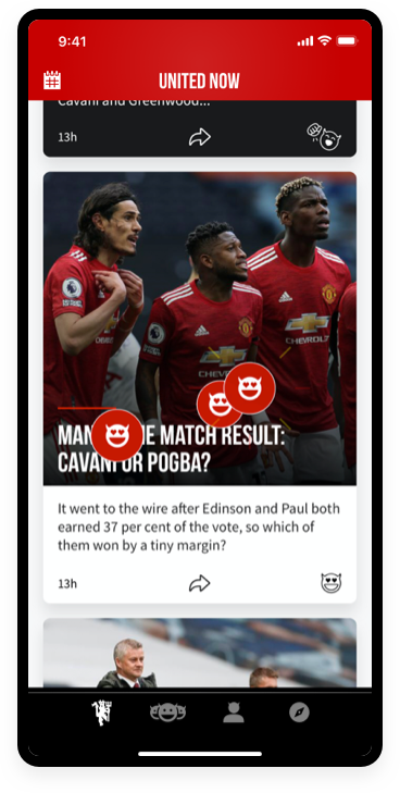
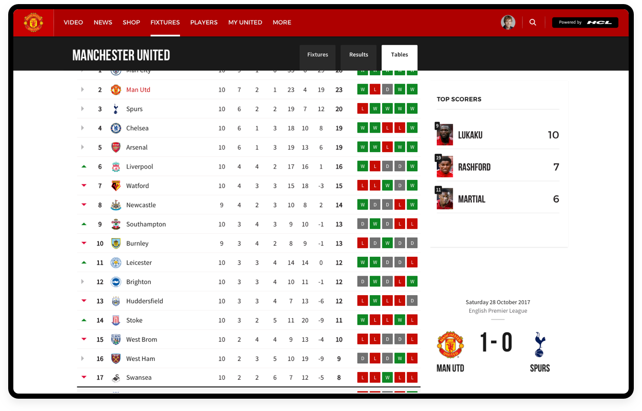
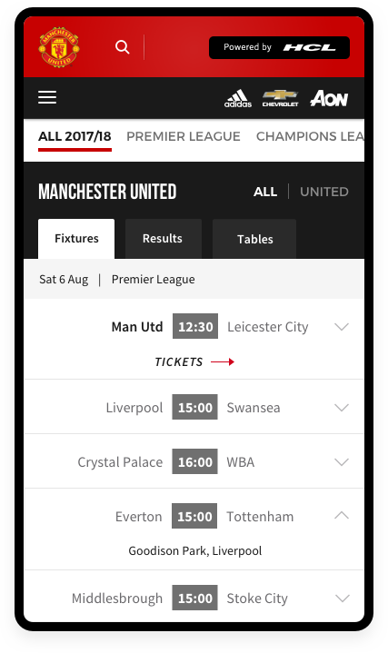
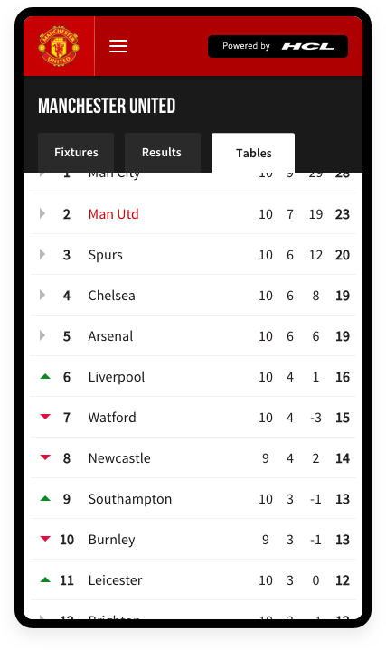
A new way of experiencing and following the game in real-time through data
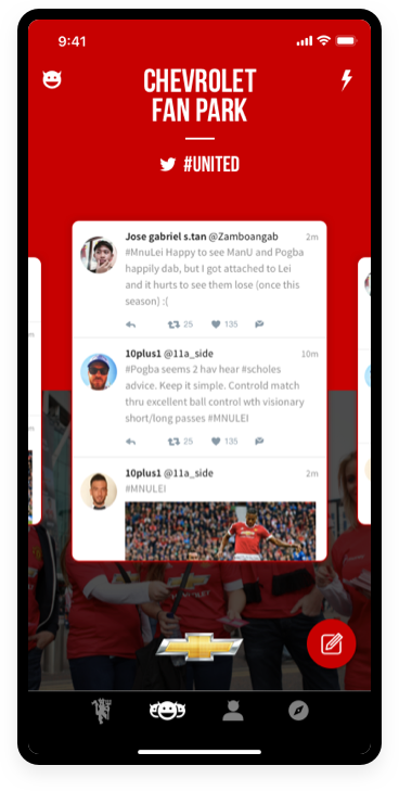
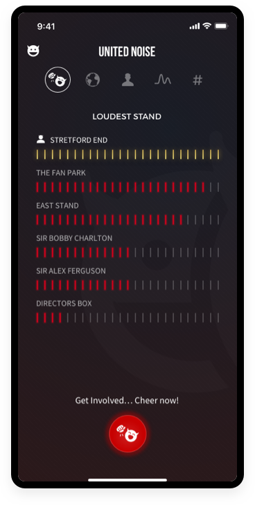
Connecting fans moods & feelings within the App building anticipation before, during and after match day
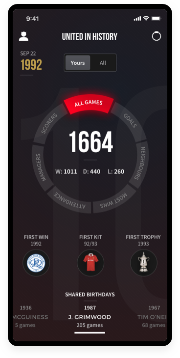
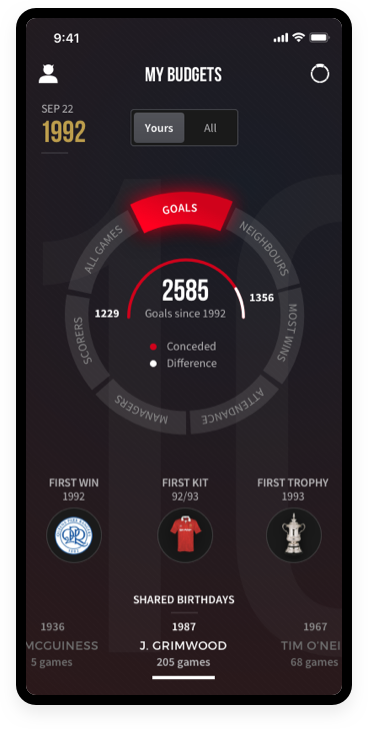
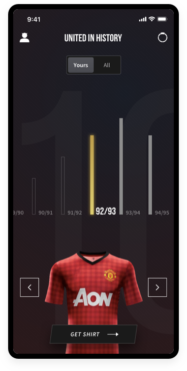
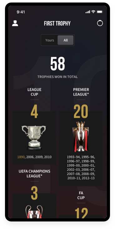
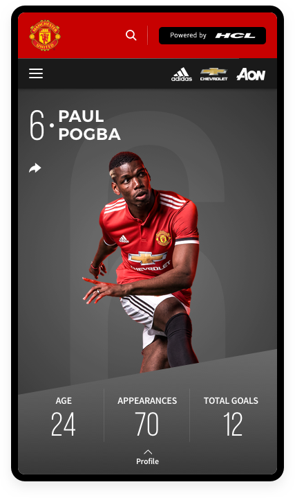
Historical club content based upon your personal details from your profile
Creating a card logic framework to cross-pollenate across products
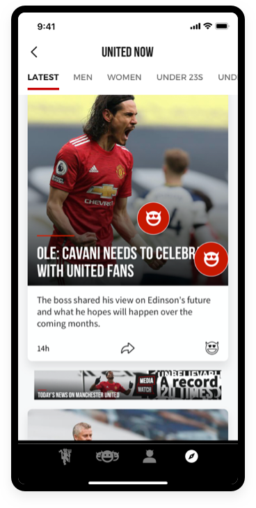
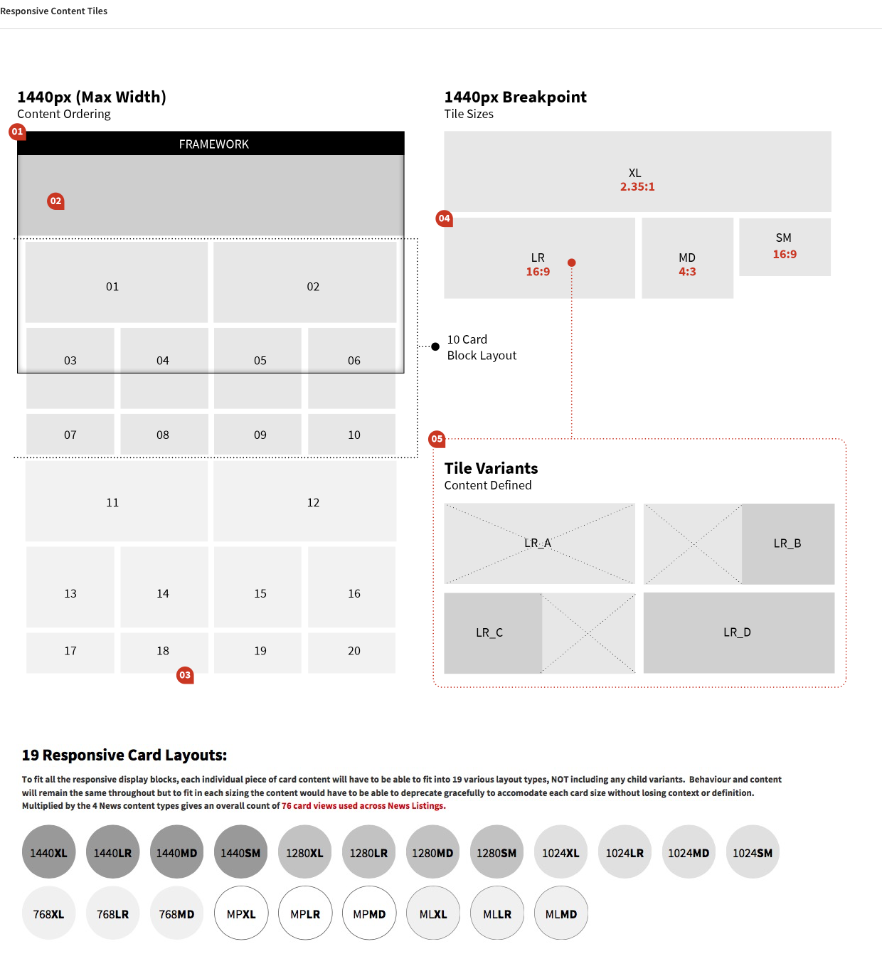
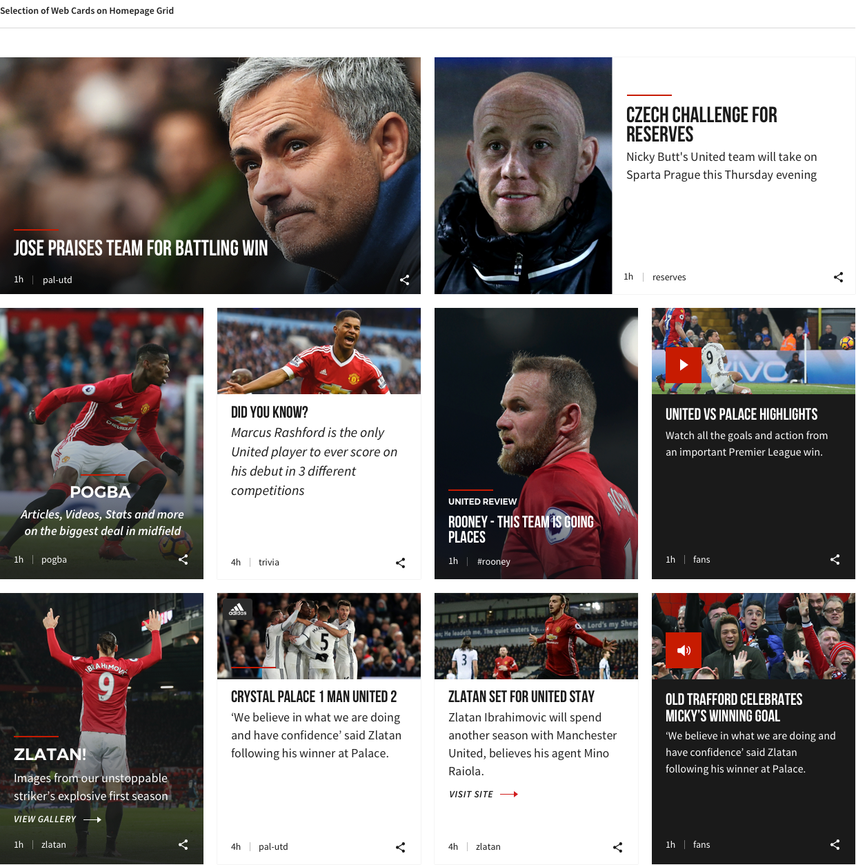
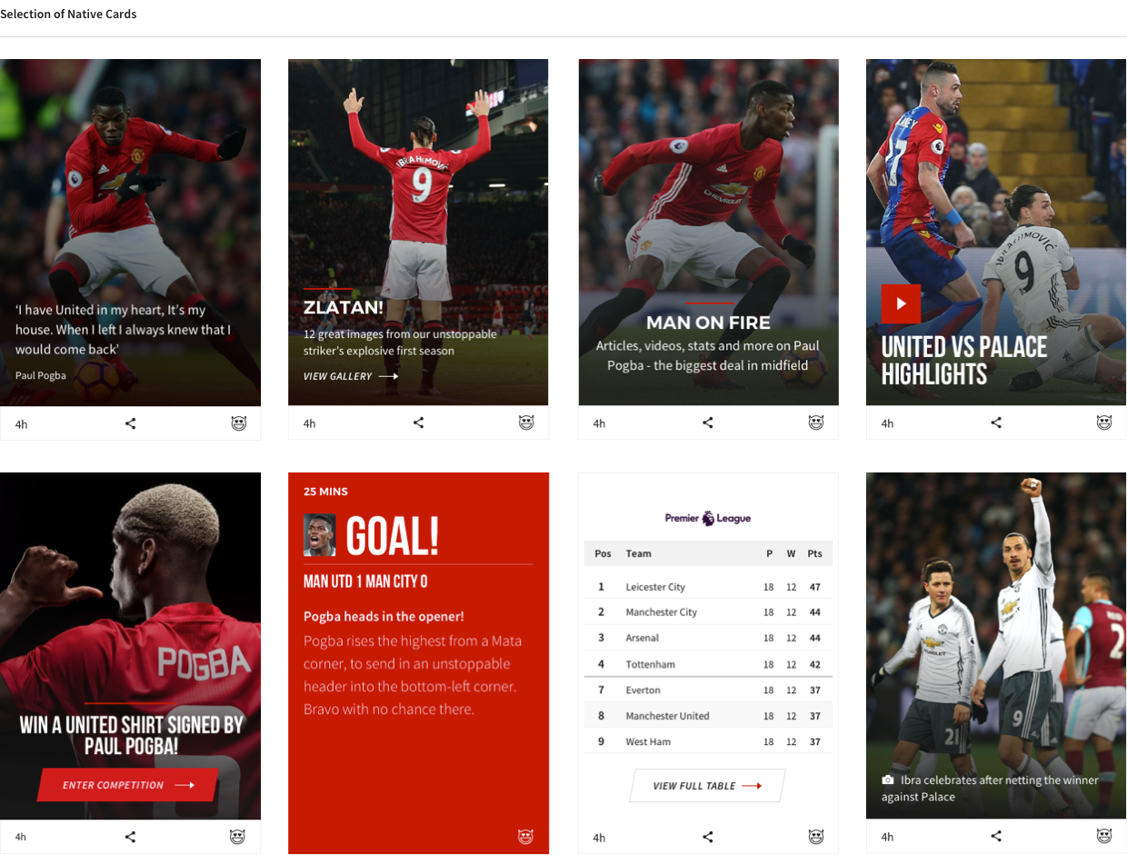
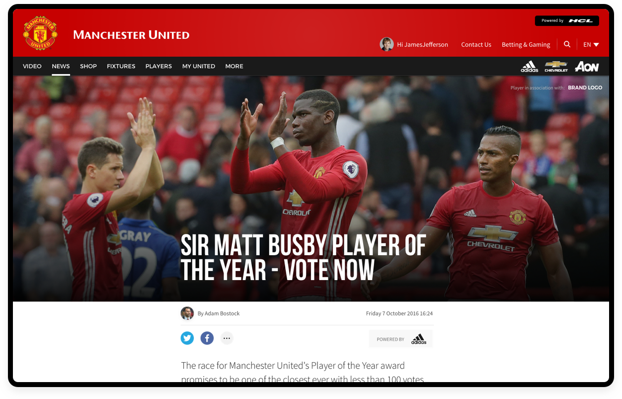
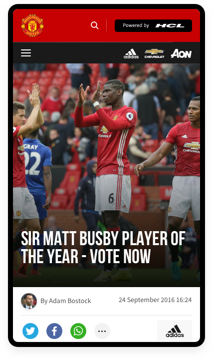
One of the primary patterns that was established early on was creating a card logic which would work across web and app - and all breakpoints. The cards were to be used across the majority of the website, with them being prominently used to create content grids on the homepage and news pages, whilst also being used extensively in the matchday feed. To fulfil the Product Team's vision on cards we created a range of different card types from news cards to video cards and match stats. All of the cards had a framework allowing them to be shared easily and for partner brands to sponsor specific content.
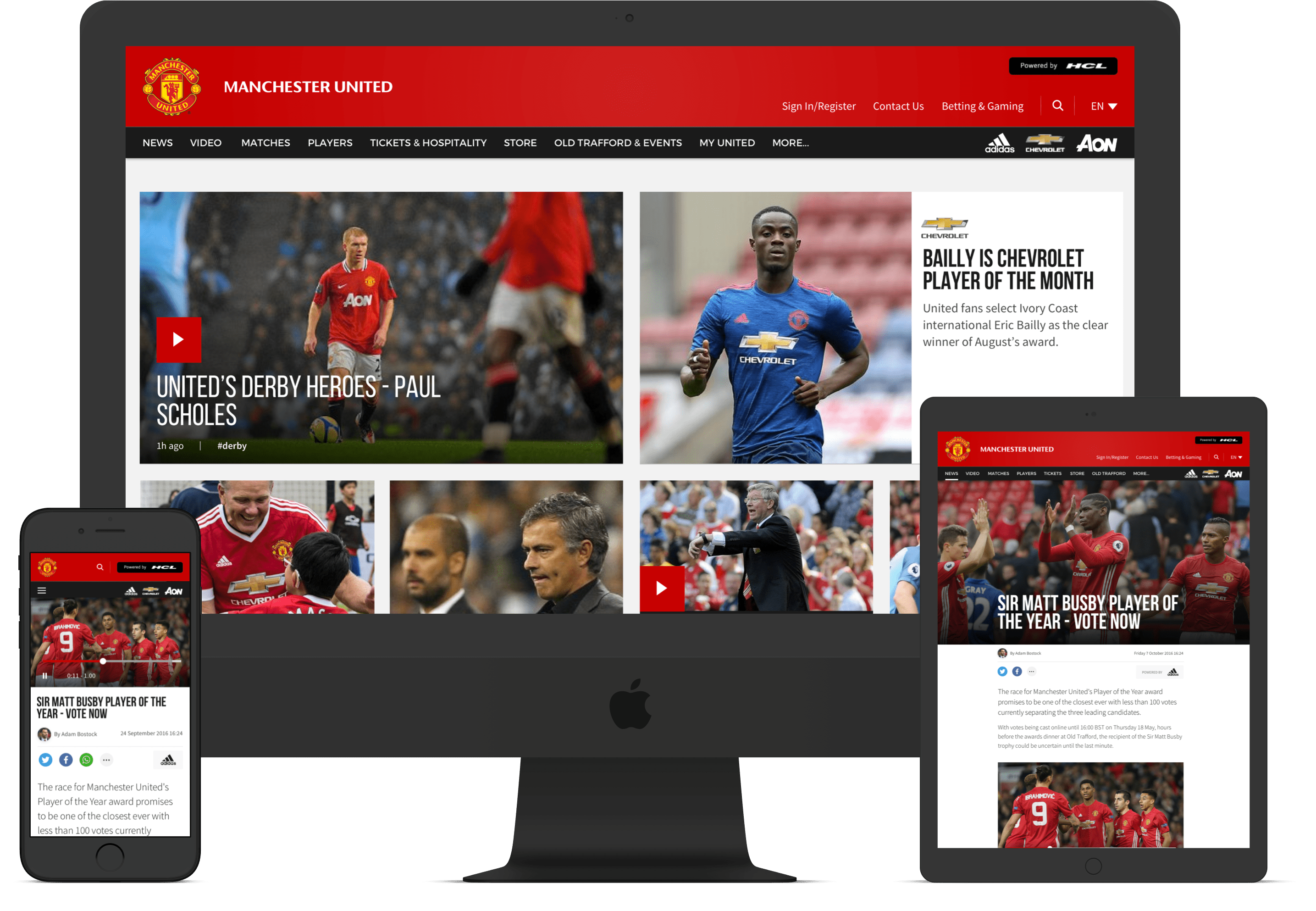
A rich and expansive website experience across desktop, tablet and mobile
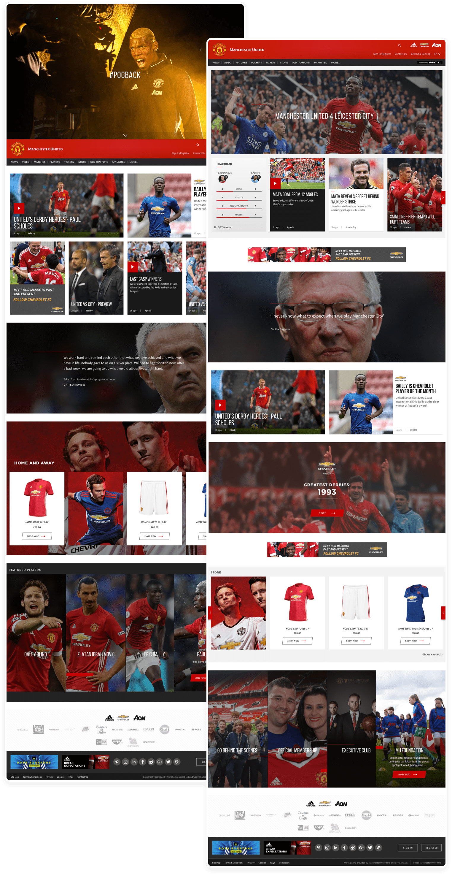
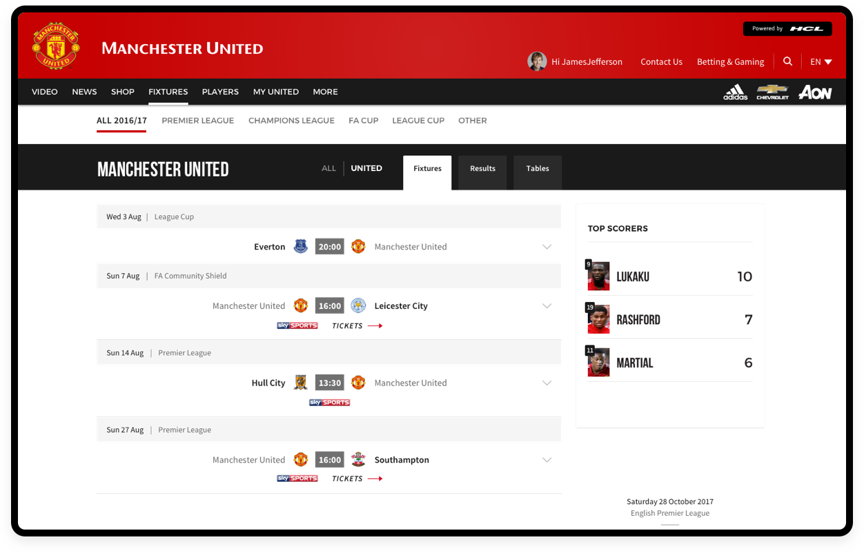
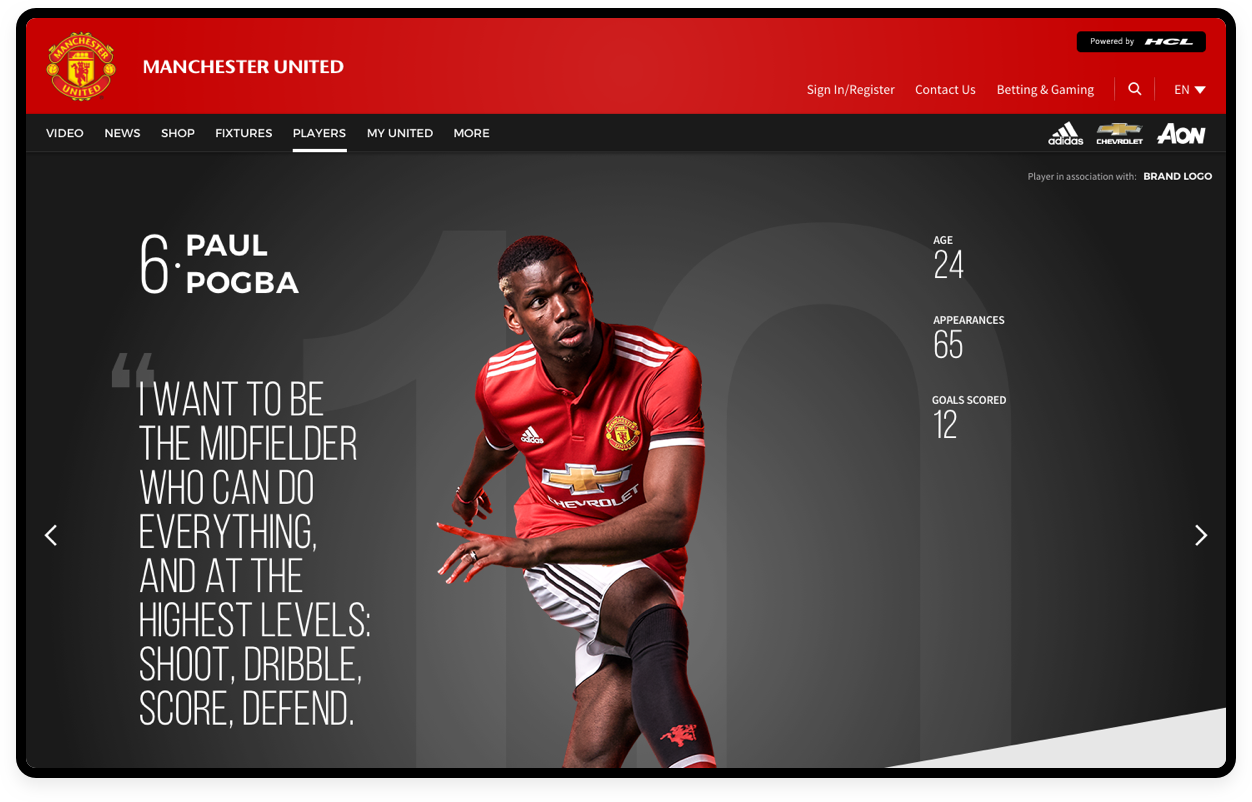
Football club websites are typically content heavy with lots of sections and pages. We established a core set of templates that we would design whilst creating a set of global components in the Sitecore CMS that would allow content editors the flexibility to create their own pages. These would tpyically be auxillary pages that sit in the mega-menu of the navigation. As mentioned above cards were re-usable across these pages always giving a link to another section of the site, reducing any dead-ends. All of the designs were created to be fully-responsive across desktop, tablet and mobile giving users the full experience on any device. We tried to mirror the app experience as close as possible to retain consistency across the board.
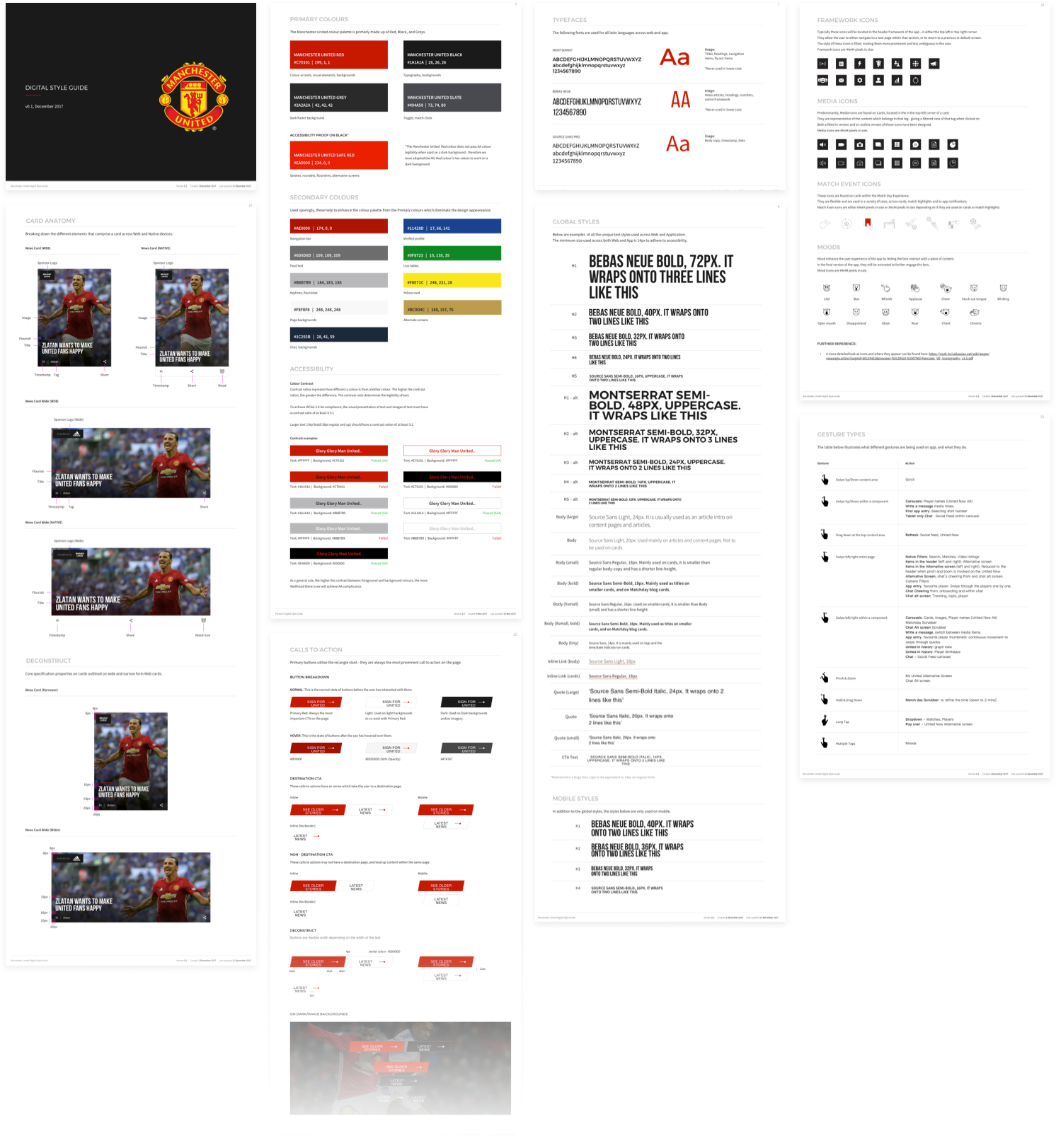
Building the foundation of a Design System with a progressive style guide
I was tasked with creating the Digital Style Guide for the project. As per a typical style guide it needed to contain typography, colours, image rules etc. We decided to make the updates to the style guide progressive in nature, meaning that after each feature set was done it would be updated. This helped us keep it as as up to date as possible. I strived to add in as much as possible into this so that in the future when a Design System would be built it would have the foundations already covered. I created a separate design library in sketch which had most of the design components that were being used across web and app to aid with this. One of the most important aspects of the style guide was the accesibiltiy and regional language additions.
In numbers

"Marko is a world-class designer and was instrumental for us delivering best-in-class products used by millions of fans worldwide. His creativity, energy and drive to succeed were an invaluable asset on a major digital transformation project and enabled us to realise our vision despite working to strict timelines. He challenged our thinking and was always open in taking our feedback on board. He was easy to work with, always affable, a consummate professional and was overall a great addition to the team".
Ben Hibbs, Head of Digital Product Management at Manchester United
