Financial well-being for past, present and future customers
Summary
Bawag P.S.K is one of Austria's largest banks. They had two main problems - the current eBanking experience is dated and uninspirational and the majority of their customer base technically savvy. In order for Bawag to compete with the competition and the slew of challenger banks it is necessary for them to offer a digital banking experience that can hold up with the competition. Klar is the native digital banking app tasked with helping the customers achieve their financial wellbeing.
Services
Art Direction, UX, UI, Interaction Design, Branding
Client
Bawag P.S.K. (2018-2021)
Challenges
Alignment
Existing technology stack and frameworks are limited, slow
and not flexible when making changes.
Ageing customer base
Majority of customers are older, less tecnically savvy and flexible to change.
Stagnant
Dated eBanking experience, lack of app presence compared
to the competitors in the market. Lack of innovation.
Consistency
Multiple products, with no clear visual/experience aligment between them. Lots of 'design debt' holistically.
Opportunities
Modernized technology stack
An opportunity to upgrade the existing technology stack, making it faster, more scalable, and more adaptable to change.
Engaging a younger audience
With an aging customer base, there’s potential to attract younger, tech-savvy customers by developing an intuitive app and digital experience tailored to their needs, building long-term brand loyalty in new demographics.
Revitalizing digital experience
The outdated eBanking interface provides a key opportunity to create a fresh, modern design that aligns with current user expectations.
Unified design and brand cohesion
A standardized design system would enhance usability, strengthen brand recognition, and reduce long-term design debt.
My role & responsibilities across the program
•Spearheading the creation and implementation of a Design System. Used by internal designs teams to reduce design debt, to accelerate design production within squads and to achieve a greater level of consistency across the products.
• Be a leader and mentor to the younger members of the team. Engaging in collaborative workshops with design tutorials and best practices.
• Leading the visual design workstreams on application and web across squads.
• Partaking in squad rituals. Stand ups, sprint planning, grooming and retrospectives, fostering a greater collaborative culture in the squads.
• Travel monthly to Vienna to be on-site, ensuring a greater connection to the team, and being more embedded in the culture.
• Elevating the quality and striving for better within the UX chapter. Always looking at best-in-class experiences and sharing them
• Team player. Making my voice heard, and ensuring that UX has a voice throughout the tribes.
• Working with ux researchers to validate and test designs through creation of interactive prototypes.
Giving klar a modern identity
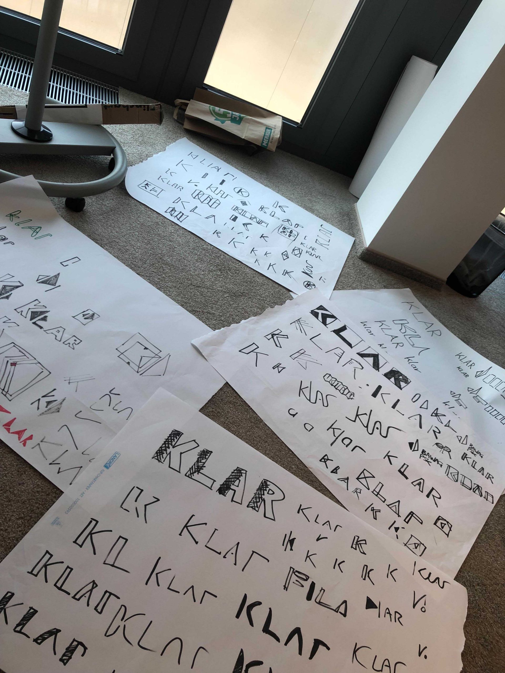
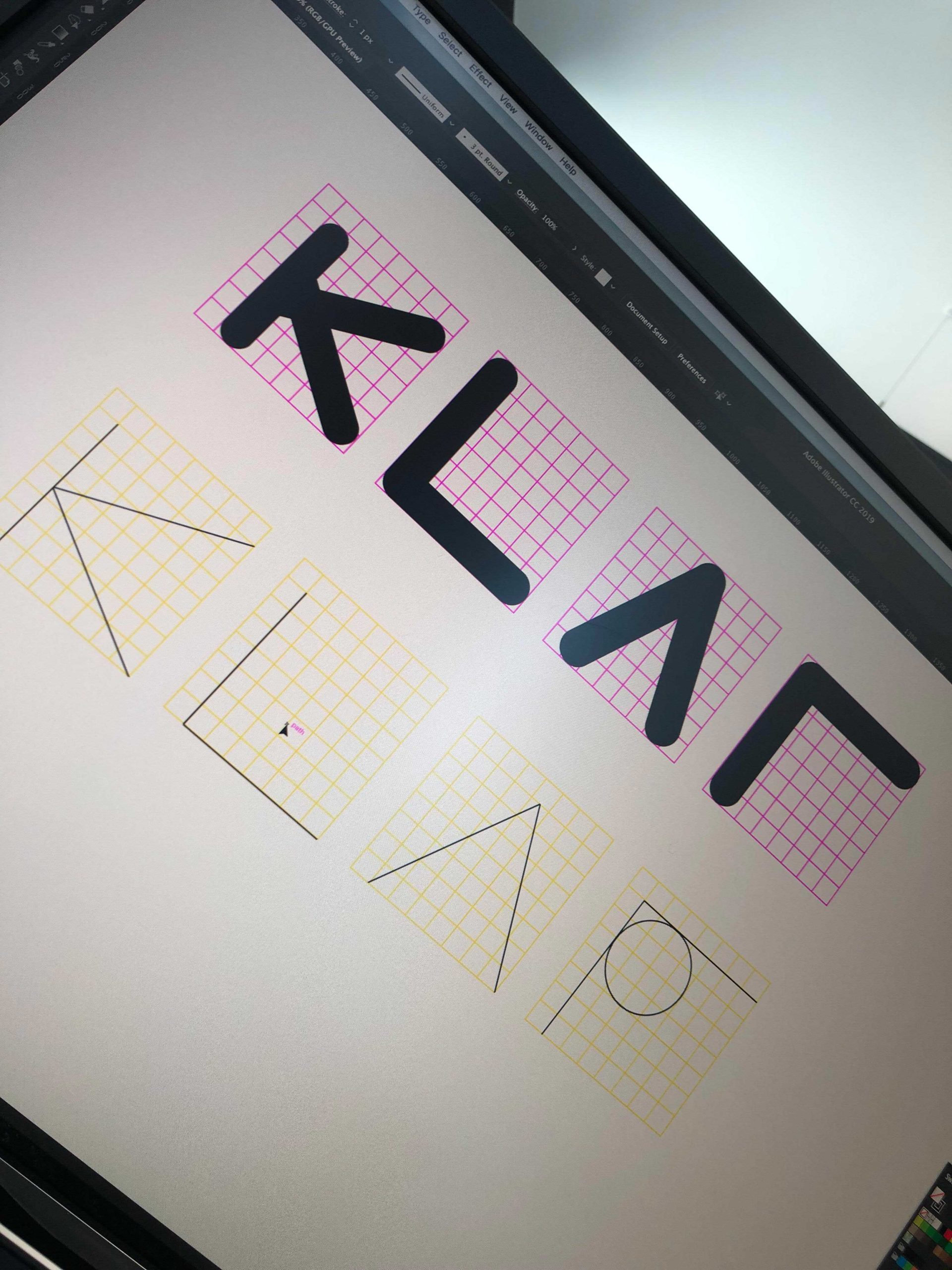
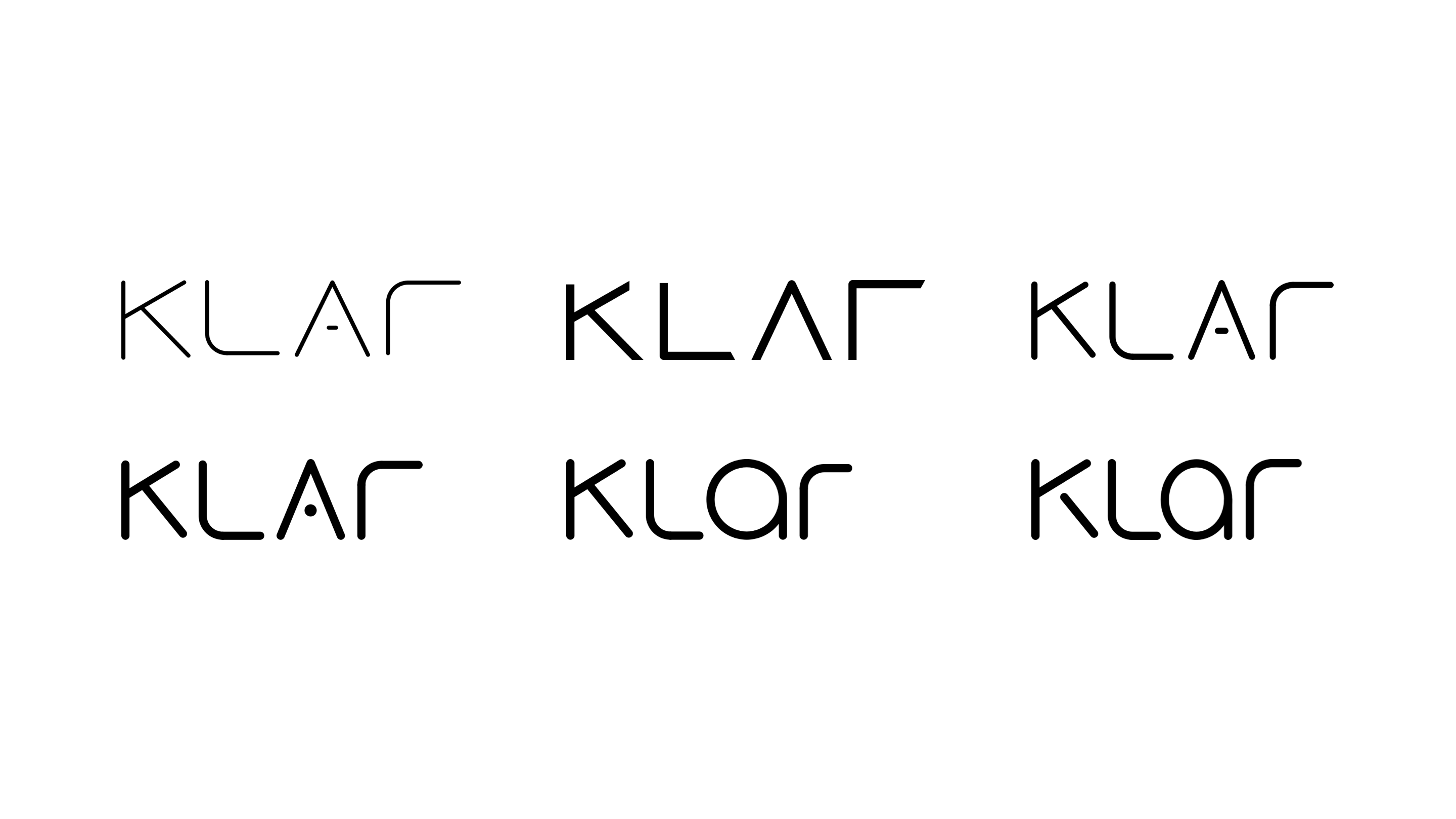
Initially the Bawag marketing team had been tasked with creating a the identity for klar. After iterations, and feedback the opportunity was given to our Design Team. After picking up the baton, we treated the re-design of the logo as a mini sprint. Three members of the Design Team were tasked with designing a route for the re-brand. I developed the chosen route further, starting from 4 identical blocks and then refining the design with each iteration. Interestingly the suggestion to change the A came from someone outside of the Design Team which I liked because good ideas can come from anywhere and this was a project which other people had took note of and wanted to have an input on.
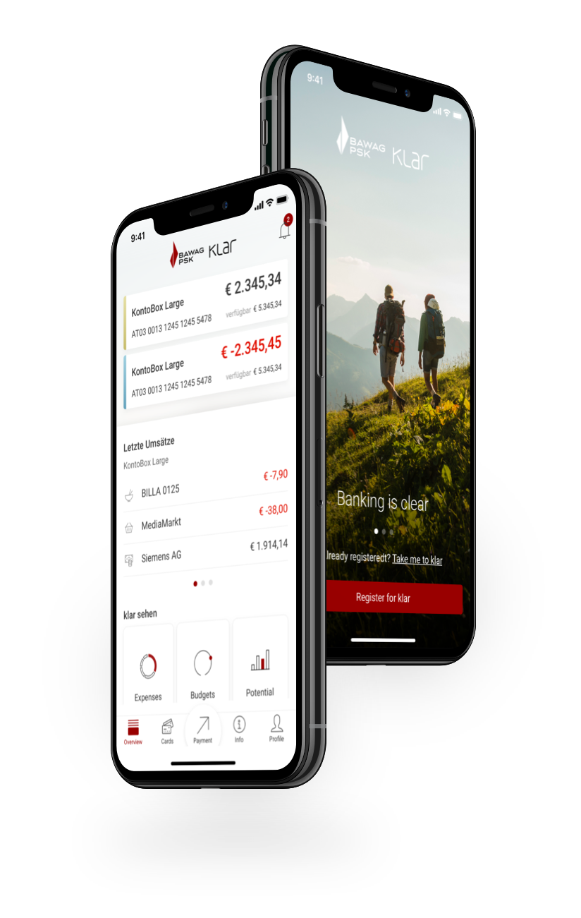
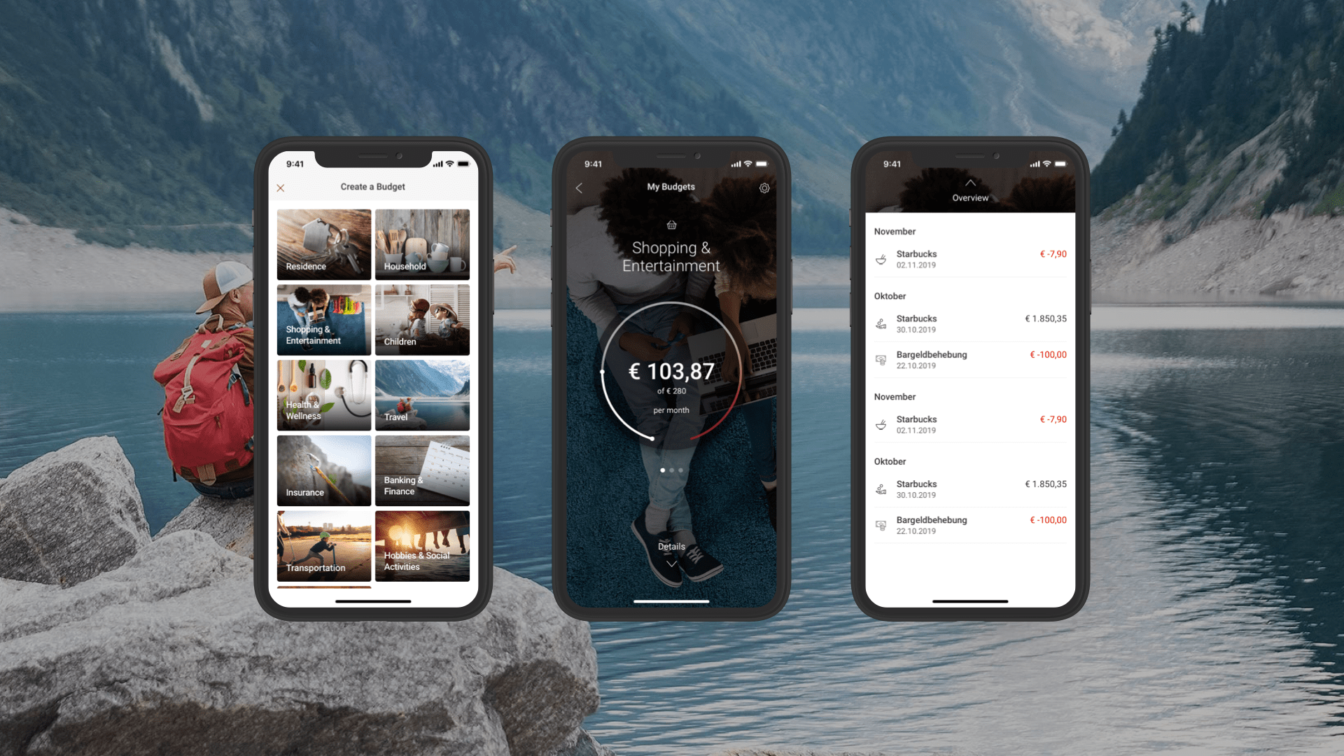
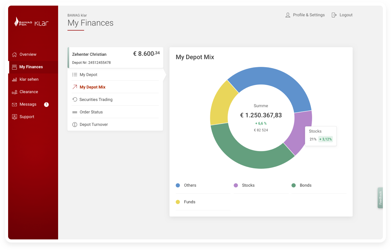
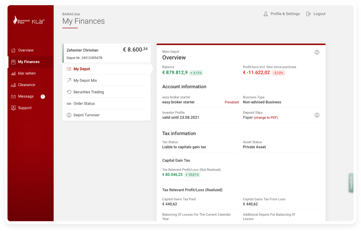
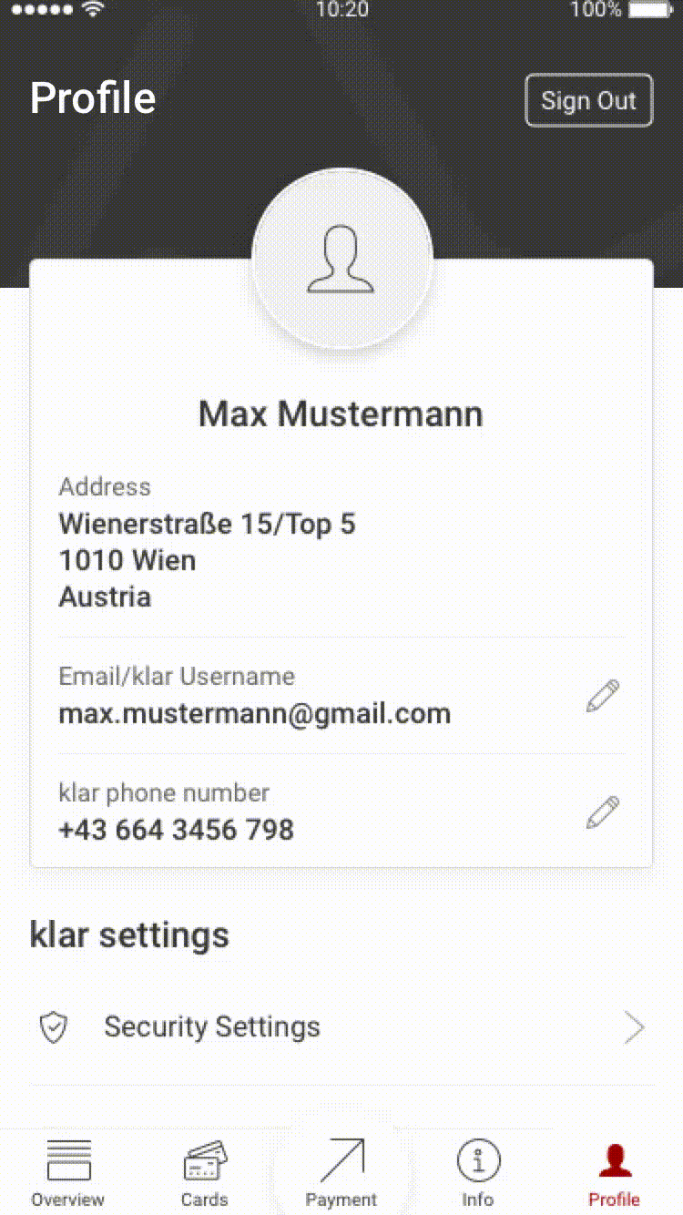
Personal finance manager - a greater control of your finances
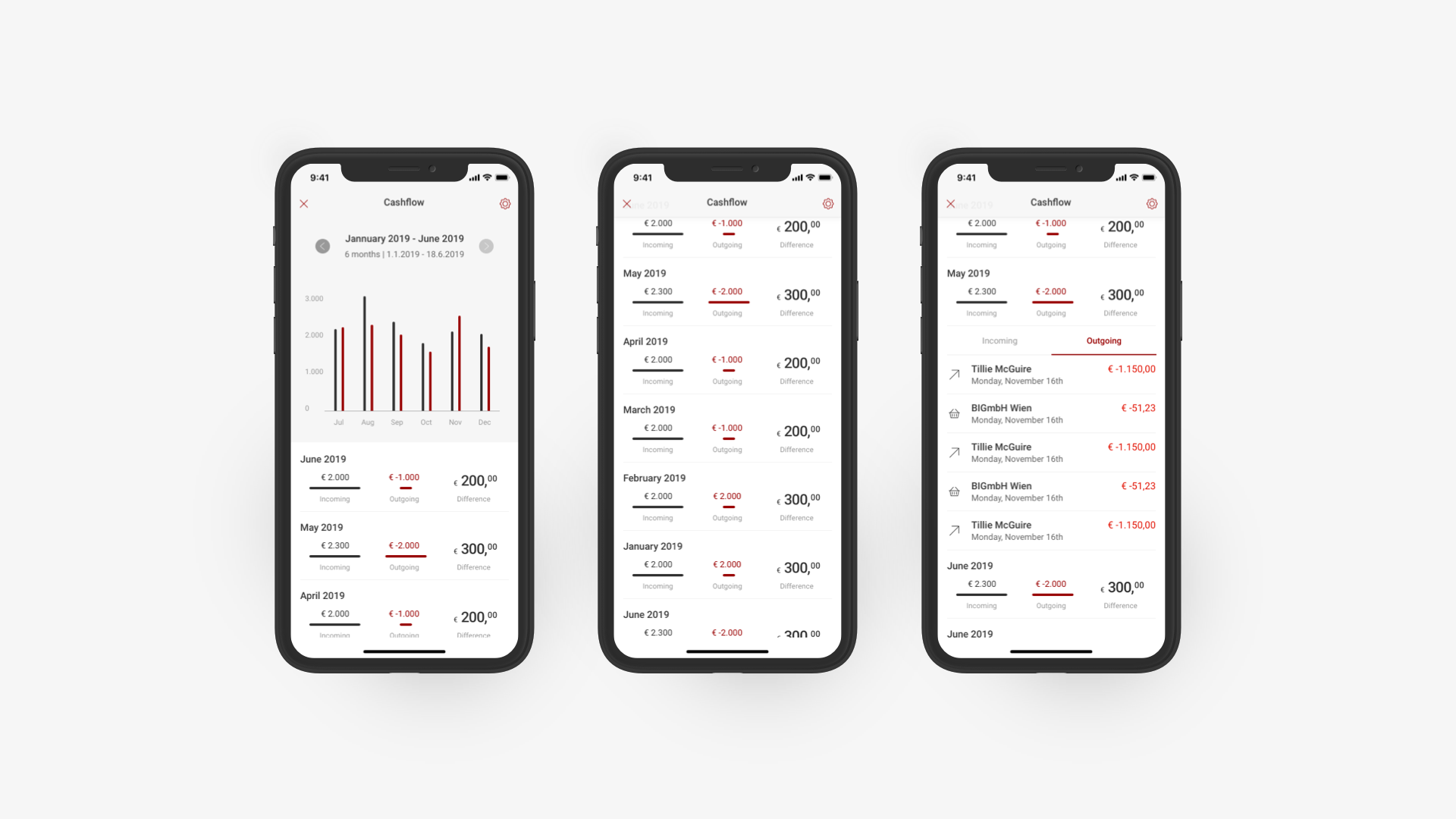
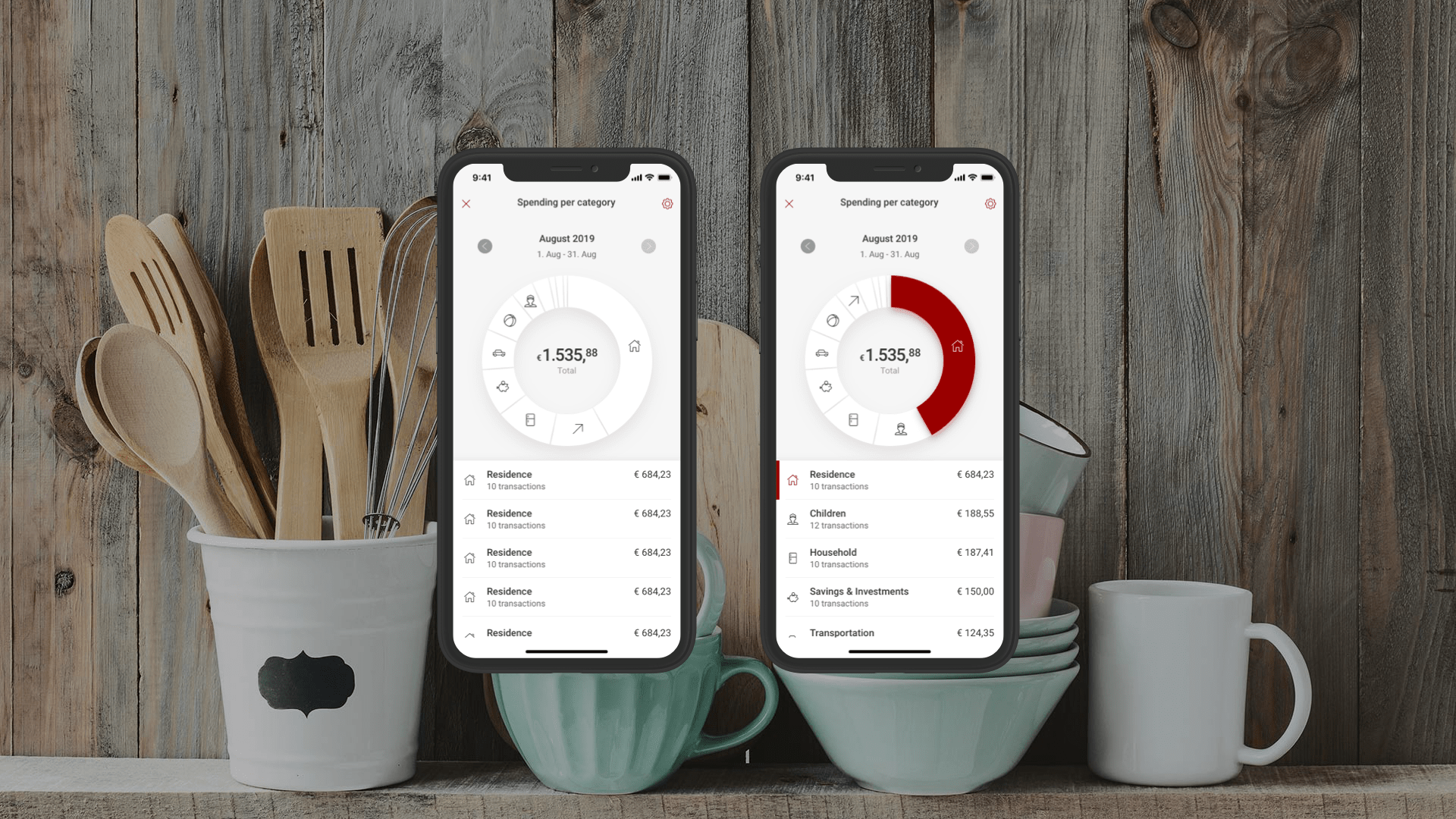
When the app was in it's MVP stage, there were only a few basic features which came 'out-the-box' with the previous platform. When we moved to a more bespoke platform, and were able to create our own features we decided that the personal finance features would be useful to customers. Budgets, spending per category and cashflow were the first of these features. Budgets let users create monthly budgets which allowed them to keep track of monthly spend on any given category i.e. shopping. It also gave us the opportunity to inject more photography into the app. Spending per category displayed a monthly breakdown of cost based on categories and cashflow showed a month to month view of incoming/outgoing numbers.
All three of the features are still in the MVP phase, further iteration would allow us to work the data harder and to use AI for a more intelligent experience.
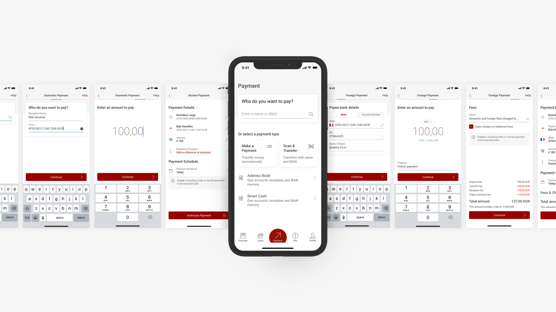
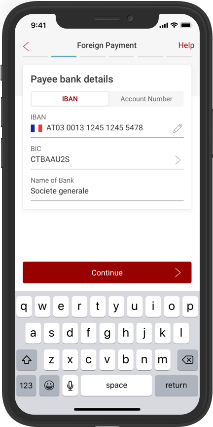
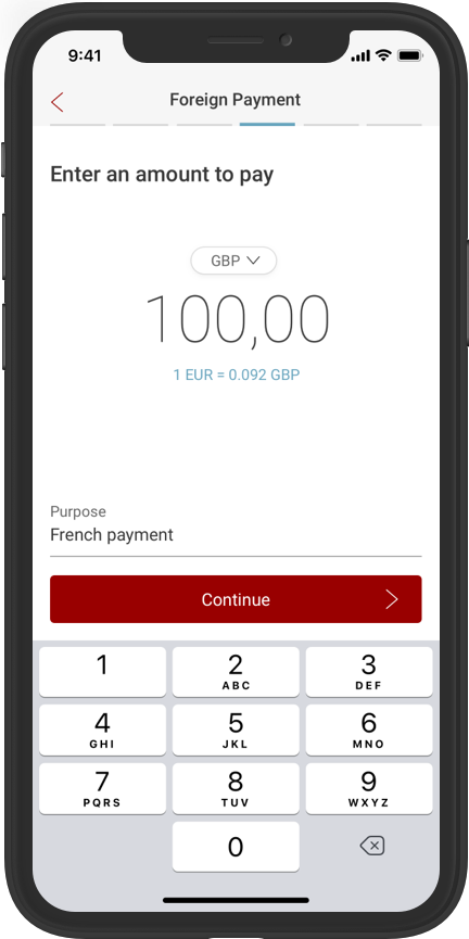
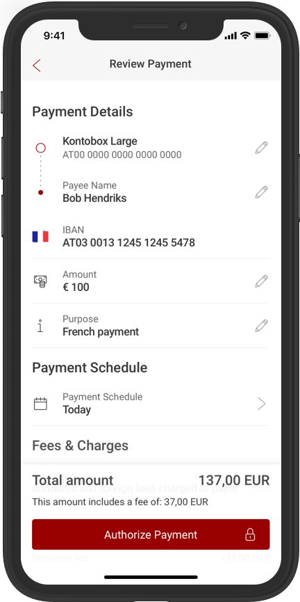
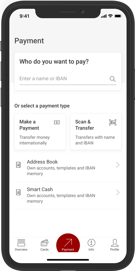
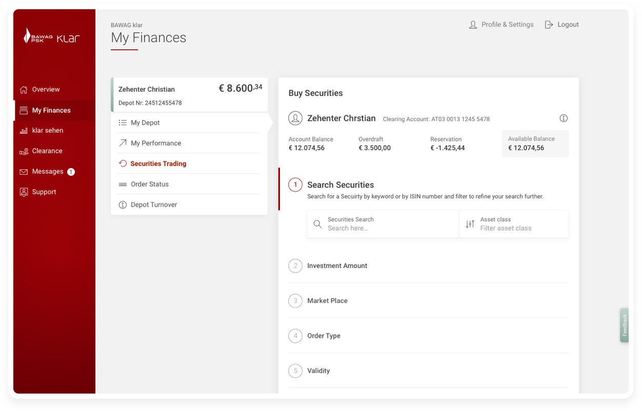
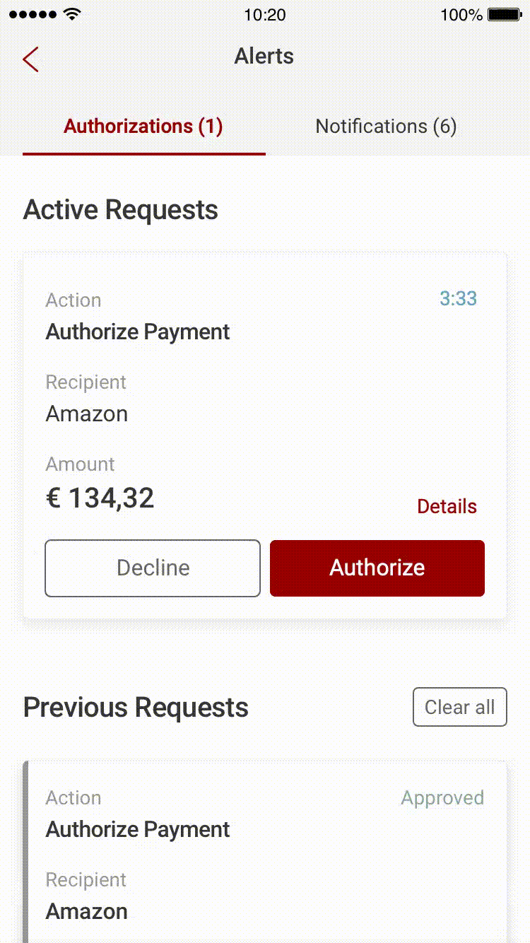
Optimising payment - A framework for all payment types in the app
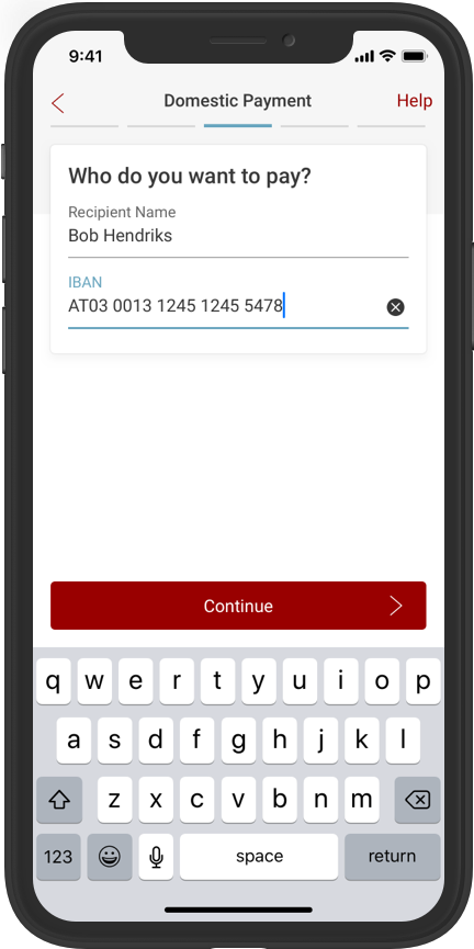
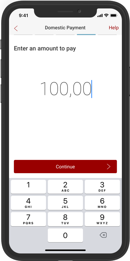
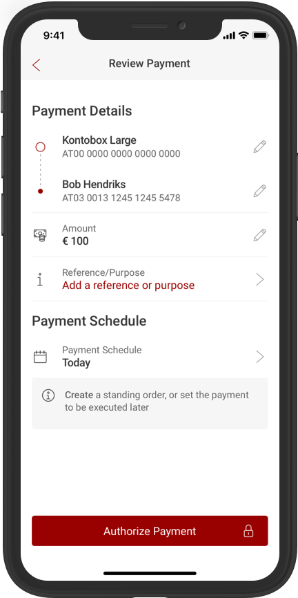
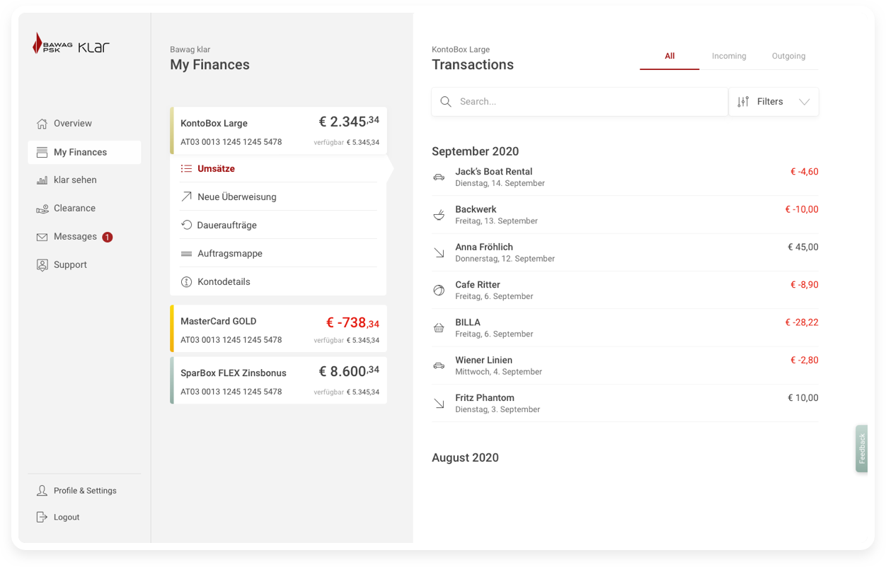
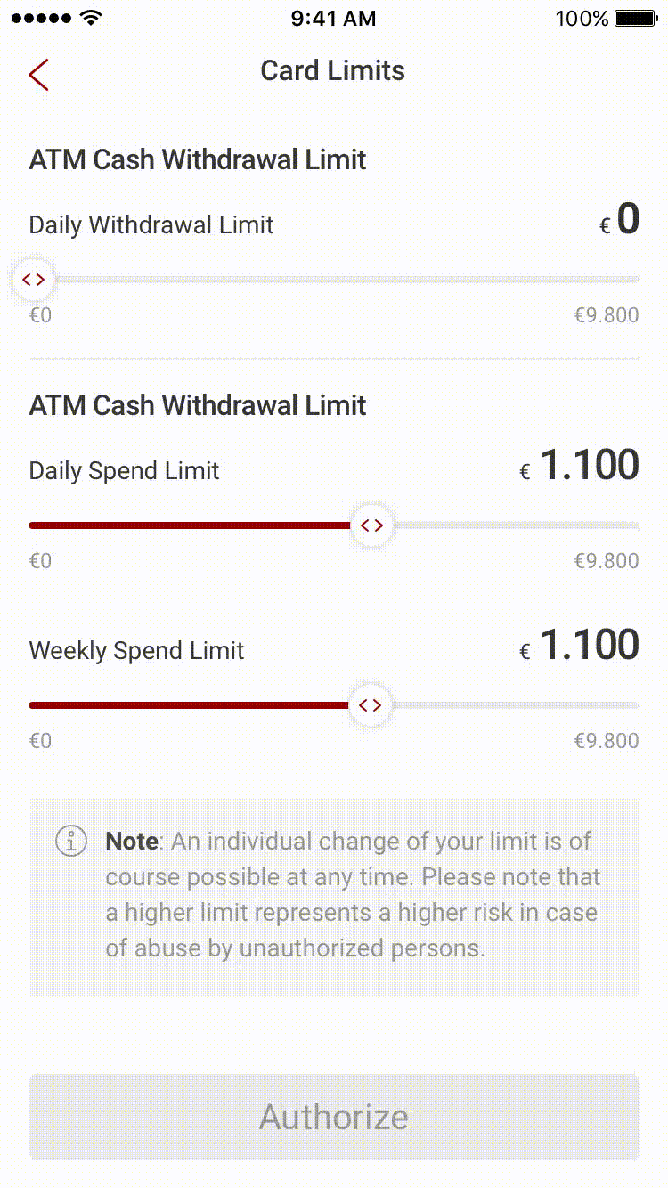
The last feature that I was working on over the last quarter was Foreign Payment. Whilst thinking about Foreign Payment, there was an opportunity for us to align the payment experience by establishing some common patterns. I re-imagined the payment entry point with a card that would carry across throughout the process, from a quick search or to a new foreign payment - the card would be persistent all the way through. By moving some of the features on the entry point screen into cards it allowed us to prioritise certain features making them more accessible to the user. In the end we were able to replicate the Foreign Payment experience to the SEPA Payment experience but just remove the steps in the flow that were not required. At the same time, the goal for this payment experience was to have as few fields on the screen as possible, so there is less cognitive load on the user, and they can get to the payment review screen in the shortest amount of time.

Refining the classic eBanking experience with klarWeb
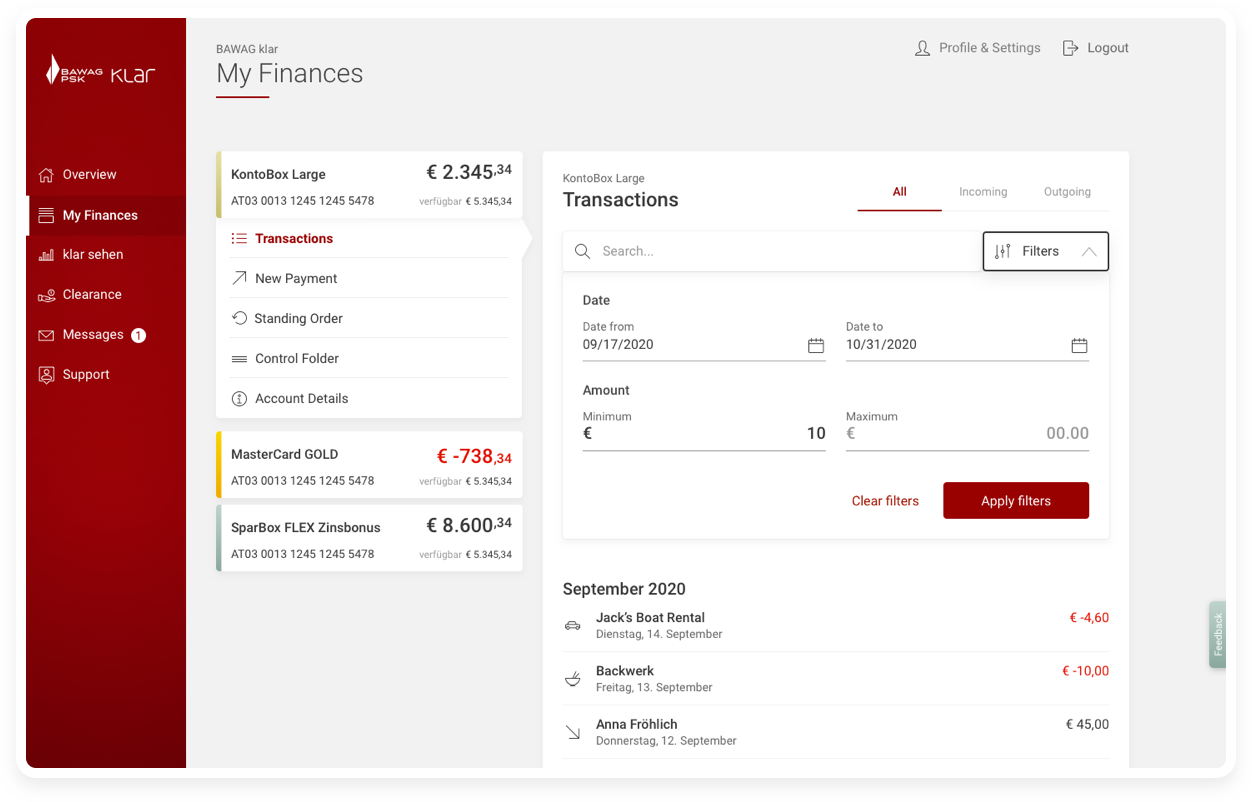
The current eBanking experience is outdated and archaic. klarWeb was the opportunity for us to give users who are more comfortable in banking on their computers an experience similar to those using the klar app. The Design System allowed us to port over the majority of the elements already used in the app i.e. cards, input fields, buttons so the focus was on how we could come up with a framework and structure to support the features. The first column was for the primary navigation and top level fatures, the second column was a product based navigation which would contextualise all the features within that account and the third column was used for displaying content. We utilised clear signposted ensuring that users would clearly know where they are on the site, and lots of white space making sure that no page would be overly cluttered and unreadable or unusable.


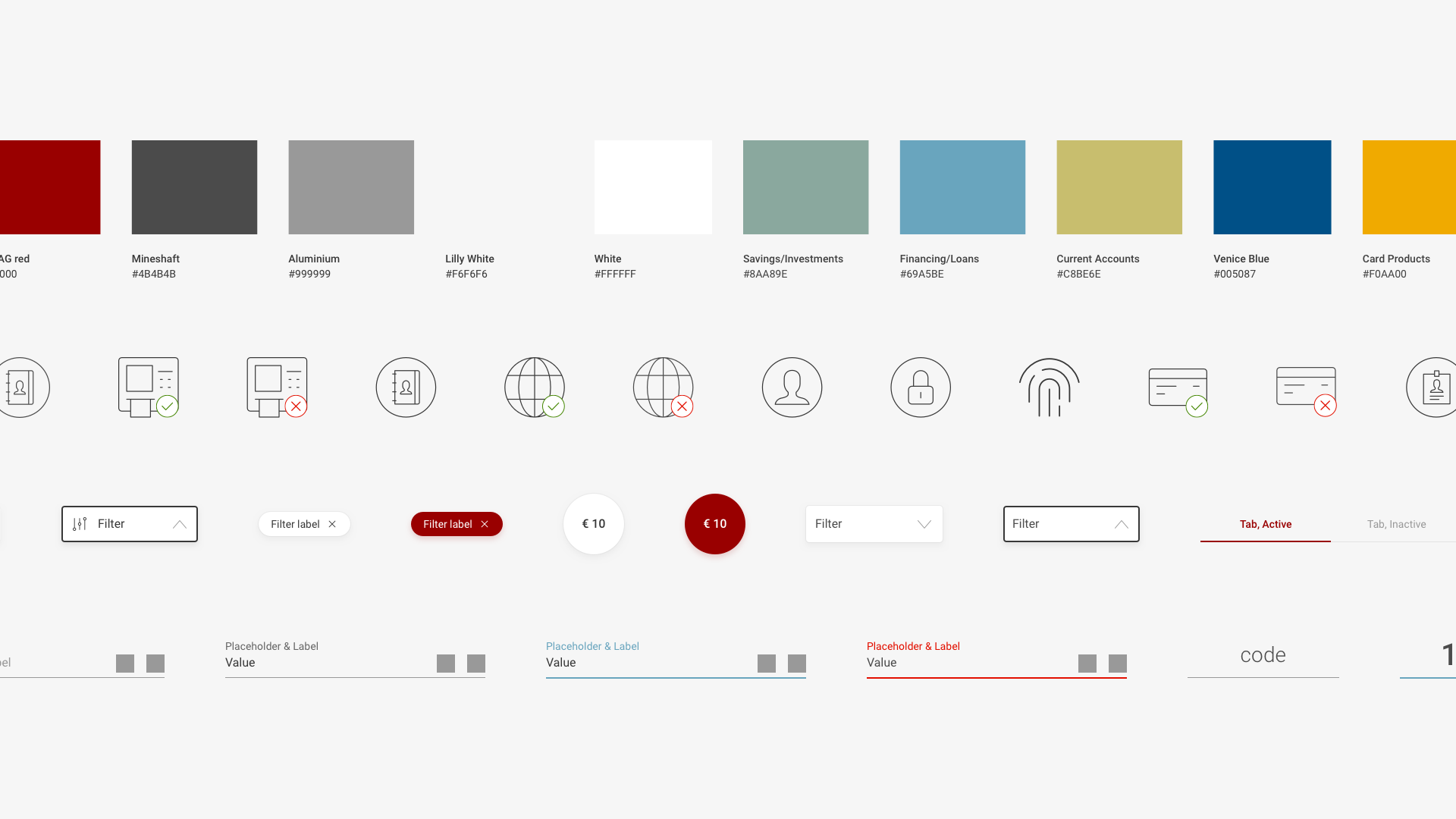
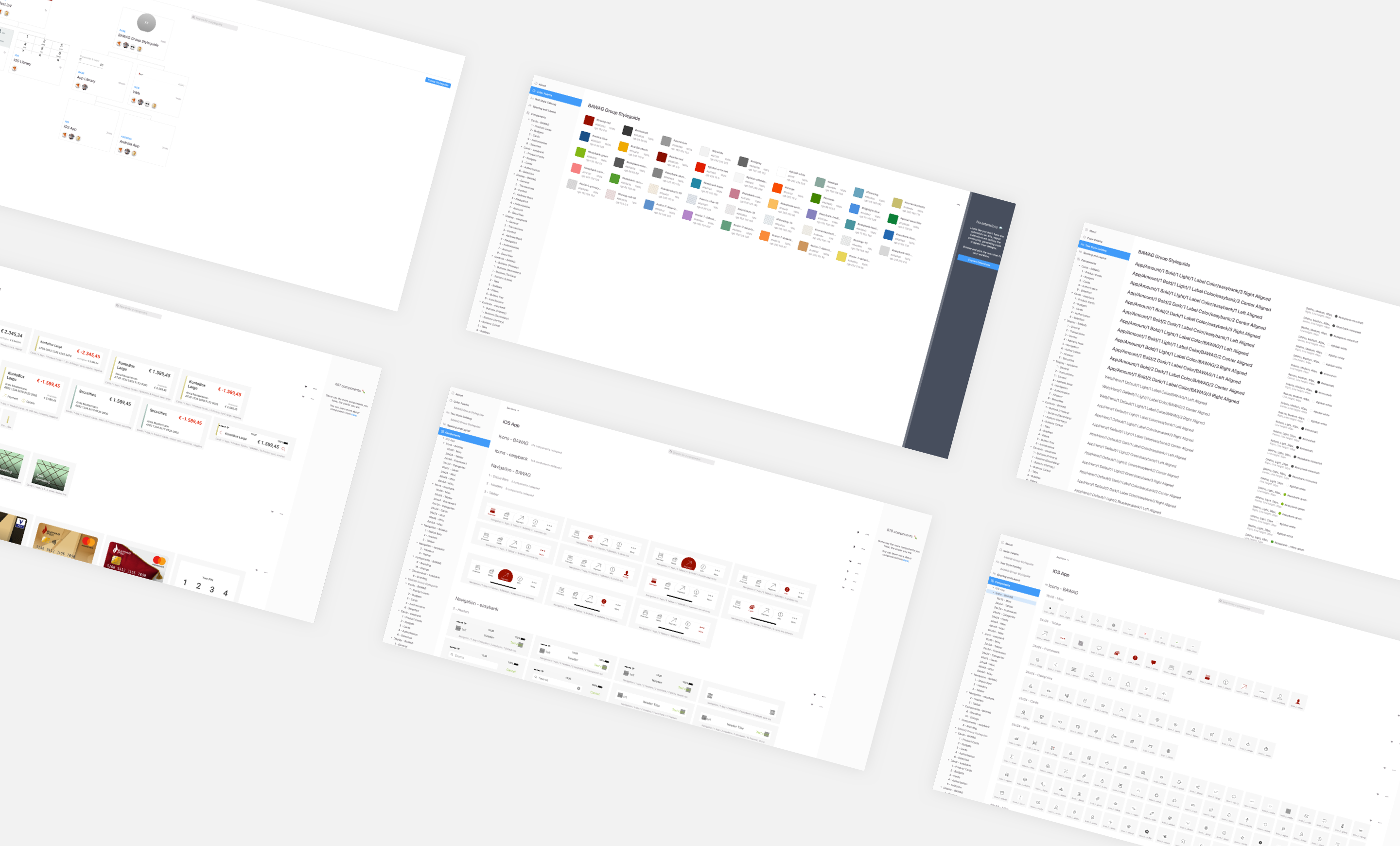
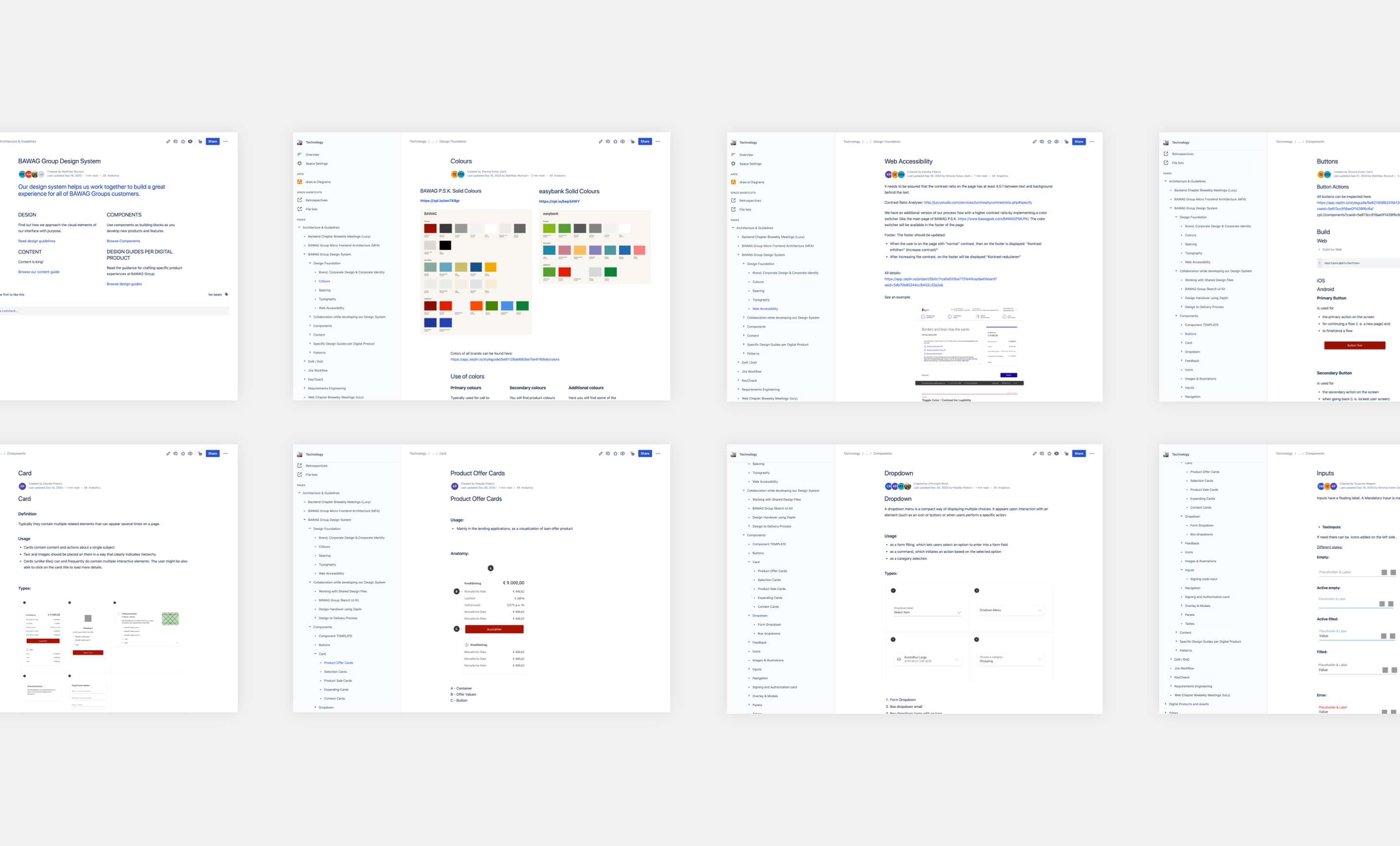
Enabling scale and ensuring consistency through a Design System
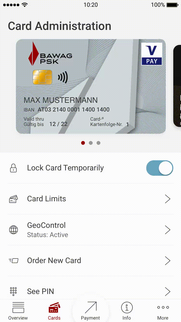
To ensure we have design consistency across the different products in the bank, a Design System has been required. A Design System is a project within itself, so we decided to start in stages first. Initially I set up a pattern library in Sketch hosted on the cloud allowing team members across the squad to use it. A lot of time was spent trying to make this a very easy to use library for the whole team using it. As Bawag has multiple products it was important that we made the library scalable so that we could customise and design the different products rapidly. From here I mirrored the Sketch library onto Zeplin allowing tech teams to build and deploy their own version of the component library. Lastly, we built the documentation pages together and hosted it all on the company’s confluence.
The Design System is an evolving project, and the next phase would be to include markup components into more of a repository website akin to popular Design Systems. One of the most important takeaways of this project for me is that the effort involved in setting up a Design System is not as much as the effort needed to maintain a Design System.
"Marko continuously contributed to the design of our digital products by delivering world-class UX and UI designs. Always pushing for creative and innovative ideas, he was a driving force in our team. Furthermore, he was taking the lead in establishing our multi-brand design system for web and app as well as mentoring and supporting the younger members of the team".
Matthias Wunsch, Bawag Chapter Lead